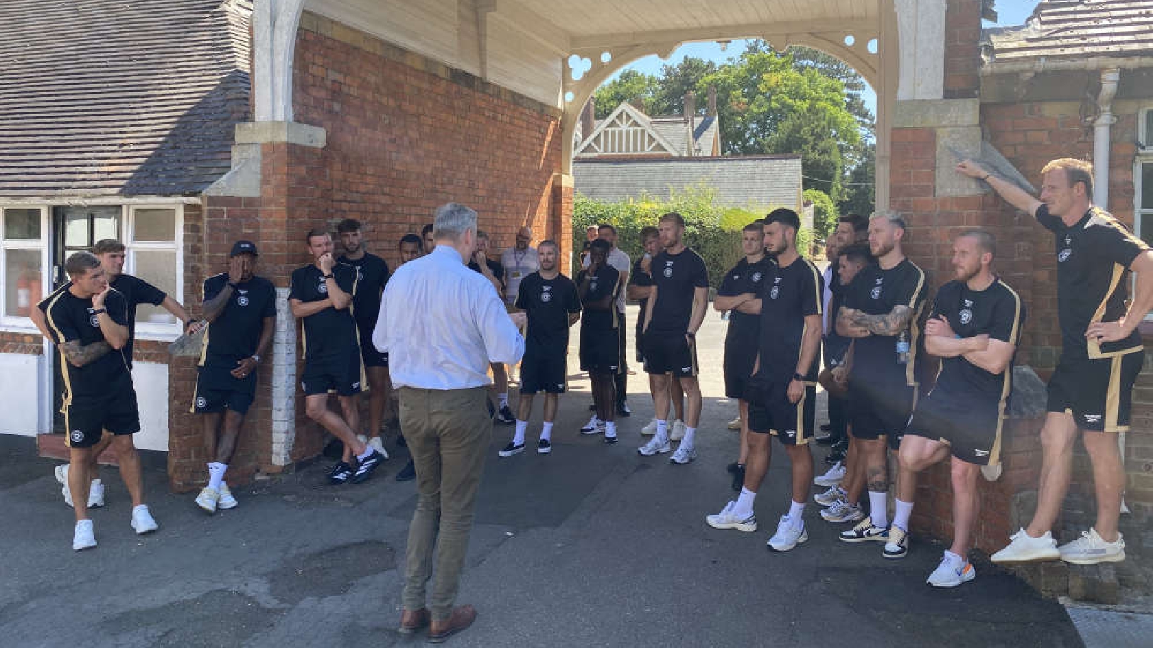
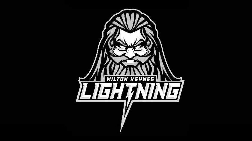
The Milton Keynes Lightning have today unveiled a brand new, drastically different logo, kicking off a new era for the club.
The majority of fans were unhappy when the club changed the logo to the previous incarnation, used during the tumultuous spell in the Elite League, and were hoping to see it replaced under the new ownership.
The new logo is drastically different from previous Lightning logos but retains a strong identity with hockey in Milton Keynes.
The popular lightning bolt has been incorporated into the logo's lettering and is at the very heart of the word 'Lightning', with this logo being the very first to include 'Milton Keynes' instead of the shortened 'MK'.
The biggest change comes in the form of the head of what appears to be Zeus, the Greek God of Lightning, who sits proudly above the team's name as the primary image that fans and opposing teams will see out on the ice.
The choice to use Zeus as the primary image links well to another club in the town, with the Milton Keynes Thunder's logo incorporating Mjolnir, the hammer that Thor, the Norse God of Thunder, wields.
These mythological representations make a nice connection for the two teams and make them easily recognisable, while the MK Storm and Storm Wreck have their own connection through the use of a helmed Viking warrior as their logos.
This connection to other clubs around MK will no doubt be the beginnings of what could be a stronger relationship between clubs, with many fans previously calling for a direct affiliation with the Thunder.
While the logo is primarily grey in colour, it is notable that background colours used across social media are black - suggesting a potential return to the club's original colour scheme.